
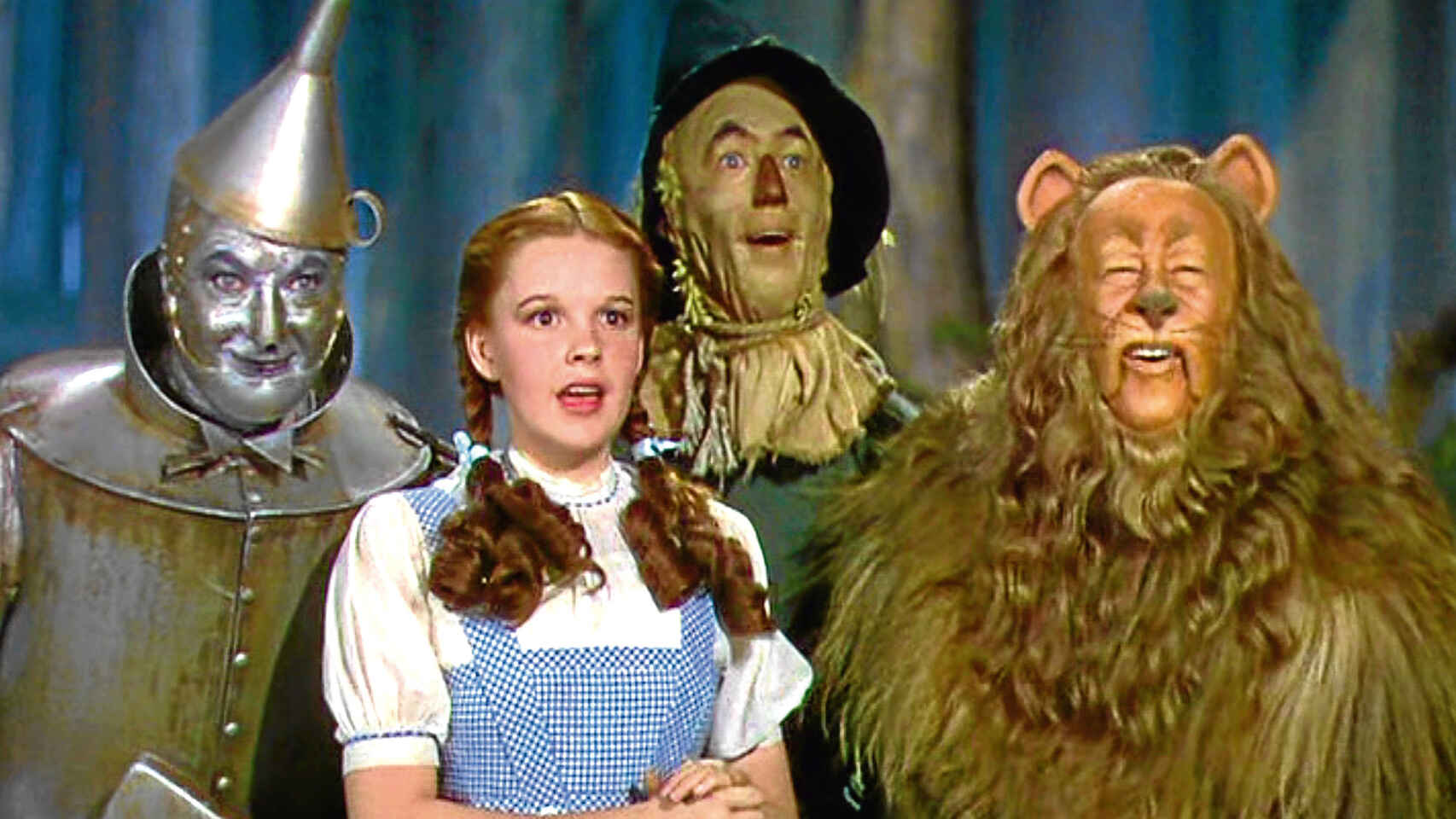
Color cinema has evolved in many ways and has played an important role in the industry. Without the proper use of colors, the idea or feeling cannot be conveyed to the viewer. What systems have been used in films to add color to them?
Beginnings of color cinema
Before proper color cinema was created, some projections already had colors. For example, in shows where the Magic Lantern was used, images on glass plates were hand-painted.
The goal of painting these images was to convey the idea of each scene with as much precision as possible. The drawings had to be accurate, so those who did it needed great artistic talent and true meticulousness.
The effort invested in adding color to the film industry demonstrates that experts knew the effect it could have on people. Today, it has been shown that colors describe environments and even convey feelings such as joy (light colors) and sadness (dark colors).
How did color begin to evolve in the film industry?
When we think of the beginnings of cinema, we imagine black and white films, but that is not entirely true. Since the 1890s, there have been attempts to add color, which is why there were people responsible for hand-painting the frames of films manually.
As expected, the process of painting scenes manually was difficult, as a one-hour film contained approximately 90,000 frames. In 1905, this work was automated and the coloring process was carried out mechanically.
The following advances that color cinema experienced were as follows:
Tinting and toning in cinema
Tinting involved bathing the images of the scenes of the films in a single color. The tones selected were in accordance with the feeling, the idea that was to be conveyed, and even with the time of day in which each scene took place.
If an image was tinted with blue color it meant it was night, yellow was used for day, and red for environments with fire. Now, in toning, the images are also colored, but unlike tinting, the white parts remained intact, as color is only added to the dark areas.
The overlay of colors in cinema
This technique began to be employed in the 1870s and was based on the trichromy of James Clerk Maxwell. He used the three primary colors in order to obtain color images, and what he did to achieve this was to overlay them.
The first to make use of this method was William Friese Green; he invented a device that displayed photos rapidly. That was what was needed for the overlay to be successful: many images projected in a short time. This created the impression that the colors were blending.
Technologies that added color to cinema
In 1912, the Gaumont company created Chronochrome; in this type of reproduction, three lenses were used. With them, the scene was photographed simultaneously and went through green, blue, and red filters. This technology was followed by those we name below:
- Autochrome.
- Cinecolorgraph.
- Kodachrome.
- Prizma Color.
- Polychromide.
- Multicolor.
- Ufacolor.
- Cinecolor.
- Trucolor.
The greatest demonstration of the evolution of color cinema arose with Technicolor; with this camera, colors were reproduced more easily. Walt Disney made use of this technology in "Silly Symphonies" and in many of his animations. However, the one considered the first color film is “The Vanity Fair” from 1935.
Excerpt Becky Sharp (Vanity Fair) the first color film in cinema
“Becky Sharp” (Vanity Fair) was the first film to use the Technicolor technique, which consisted of creating a separate film for each of the three primary colors as mentioned earlier.
Key films in color cinema using the Technicolor technique
Just like with sound, color needed to show credibility and, although it was difficult at first, it gradually gained importance. Films that were recorded in a single setting and without colors seemed to take place at the same time, but that changed with color.
A film in which colors were used for artistic and narrative purposes was “The Wizard of Oz” from 1939. The most interesting thing is that in the scenes depicting Dorothy's real life, the images were in sepia and black and white.
When Dorothy arrived in Oz, the colors changed radically; they became more vibrant, which conveyed positive feelings. At first, colors were reserved for productions with better budgets, but this changed after the 1950s.
Other highlighted films
Just like in “The Wizard of Oz,” in “Coraline” by Tim Burton, a similar use of colors was given. The tones of the world of the living were desaturated and muted. In contrast, in the world of the dead, the colors were bright and vivid.
In the case of the 1998 film “Fear and Loathing in Las Vegas,” the color palette shows the anguish felt by the protagonist. On the other hand, in “Only God Forgives,” a warm tone is used in the scenes where the protagonist is being bullied and a cold one when he is the one doing the bullying.
The feelings conveyed by colors in Cinema
As you can see, the choice of colors is not something left to chance, which is why productions have directors of photography. These professionals know what color can generate a psychological reaction in a person.
The sensations associated with some colors are as follows:
- Yellow: insecurity, naivety, obsession, madness, and illness.
- Blue: isolation, calm, passivity, and coldness.
- Orange: warmth, happiness, friendship, sociability, and more.
- Red: passion, love, anger, danger, violence, and power.
- Pink: femininity, empathy, beauty, sweetness, and innocence.
- Green: corruption, nature, and immaturity.
- Purple: fantasy, ominousness, and illusion.
Now that you have this information, you should pay attention to colors the next time you watch a movie, as it is truly a fundamental aspect that is worked on when making a film. This process is currently done in post-production, and it is called "color correction and grading."
Logically, work is done beforehand before filming, collaboratively between the director of photography (lighting director in television) and the film director, who decide how the final look will be based on the intention of what they want to convey in the images.